Blog post -
Greenery Pantone Colour of the Year!
Every year since 2000, the Pantone Colour Institute, which calls itself the “global colour authority”, has chosen a colour that reflects the current cultural climate.
In the following years, the colour has historically influenced trends in all facets of design - architecture, interior décor, fashion, food, travel.
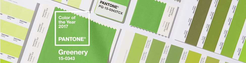
This year, the company has revealed a zesty shade of green as its colour of the year 2017. The colour, named Greenery, is described by Pantone as a “tangy yellow-green” often seen in foliage.
Greenery signifies beginnings: a fresh New Year; healthier food resolutions and growing vegetarian trends; grass and the outdoors during spring and summer.
But most prominently, the yellow-green hue (specifically, Pantone 15-0343) comments on the concept of “environment.”
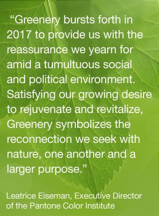
In an interview with the New York Times, the executive director of the Pantone Colour Institute, Leatrice Eiseman, said the choice was made in response to a “stressful and tense world”.
Most obviously, “environment” today refers to the “go-green” movement, which has reached a crescendo this year. Pantone has even partnered with Airbnb to create an experience in nature inspired by the color.
“There’s a growing desire to reconnect with Nature and what is real, and find ways to disconnect from technology. We need a break. We need to stop and breathe,” Laurie Pressman, the Pantone Color Institute’s Vice President, told FORBES. “(Greenery) is about unity and community—connecting to oneself and others and a higher purpose, Nature.”
Contrary to what many have reported, the selection of Greenery wasn’t directly influenced by the green of money or the recent election. “Nature is free, and the color isn’t meant to be partisan,” Pressman said.
Greenery is not a “green with envy” hue. Greenery actually taps into the opposite: minimalism.
Pressman additionally cited how companies such as H&M have started environmentally-friendly lines, often made with recycled materials.
“At New York Fashion Week, the designers were explaining how we live in this modern world where technology will always exist, but there’s this need to turn to design to go to the opposite side, to Nature,” Pressman said.
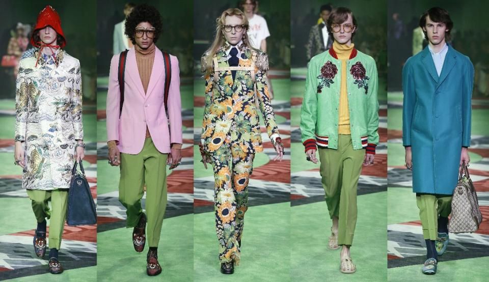
Appropriately, Greenery was especially prominent on this year’s runways, walking in various forms at Gucci, Kenzo, Bagelencia, Michael Kors, Zac Posen, and Cynthia Rowley.
Along with the unveiling of the color of the year, Pantone created a selection of 10 pairing Greenery with neutrals, pastels, brights, deeper tones, and metallic.
For 2016, Pantone picked two soft colours – a baby blue and a dusty pink. Brownish-red Marsala and purply pink Radiant Orchid were announced in 2015 and 2014 respectively. Emerald was 2013’s colour, and 2012 saw Pantone select the bright orange Tangerine Tango.
Enjoy the video realised by the Pantone Colour Institute!
Sources:
Read more Swedbrand blog posts at swedbrand-group.com/blog, or visit our website at swedbrand-group.com.
Topics
- Packaging, packing