Blog post -
2 great packaging designs from 2015
BP&O’s British freelance designer and writer Richard Baird made a selection of 2015’s package design highlights.
Here are 2 package designs that blew our mind away.
Springs’ Smokery by Distil
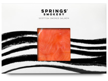
The packaging’s artwork is stunning: the black/white contrast enables the vivid color of the salmon to fully grab the customer’s attention and to highlight the product’s freshness.
By including a transparent window to get a glimpse of the product and by adding the color contrast of product and packaging, this design really made its point.
This packaging comes in a series of hand-drawn illustrations, all held in black-and-white and combined with the striking color of the salmon.
Mr Baird mentions: “a conceptual and communicative simplicity that makes a connection with the traditional craft and process of smoking salmon but also draws on the themes of heritage and the sea”.
Click here to find Mr Baird’s full review about Springs' Smokery.
Soap Co. by Paul Belford Ltd
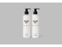
Soap Co. is a British based social enterprise, a luxury soap manufacturer and a brand; 70% of the people employed there are blind, disabled or disadvantaged.
Their latest range of luxury handmade soaps, hand washes and hand lotions reinforces their brand identity by adapting the packaging to the need of the blinds. The packaging combines simple uppercase sans-serif writing with Braille.
This packaging is a great balance of luxury, shown by the artwork’s cleanliness and aesthetics currently associated with high-quality cosmetic brands, and the brand’s sensitivity to a group of people whose needs are often overlooked by society and overall packaging.
Find out what Richard has to say about this packaging here.
Discover Richard’s 3 other favorite package designs here.
Topics
- Packaging, packing
Categories
- artwork
- soap
- salmon
- swedbrand
- packaging
- design