Der Lethal-Code: Wie KittoKatsu die Indie-Ikone lethal cosmetics neu erfindet, ohne sie zu verraten


Seit 2017 gestaltet die Düsseldorfer Agentur KittoKatsu das visuelle Gesicht des New Fall Festivals – jedes Jahr neu interpretiert. Die Plakate prägen monatelang das Stadtbild und werden zum Gesprächsthema. Dieses Jahr: fluide 3D-Skulpturen im Glass Look. Die Partnerschaft mit New Fall und Hamed Shahi ermöglicht mutige Gestaltung, die Kulturdesign als temporäre Kunst im öffentlichen Raum versteht.
KittoKatsu entwickelt Branding für bahnbrechende GemeindeTeams im Erzbistum Köln: Aktive Gemeindemitglieder übernehmen offiziell Verantwortung - ein Paradigmenwechsel für die katholische Kirche. Die Tangram-inspirierte Identität macht Partizipation erlebbar. Cutting through the ordinary funktioniert eben in jeder "Branche".

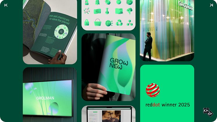
KittoKatsu gewinnt zwei Red Dot Awards 2025 für Kümmerlein und Grolman – Beweis, dass B2B-Marken erfolgreich Kategorie-Codes durchbrechen können. Eine Elite-Wirtschaftskanzlei ohne Stock-Klischees, ein Chemieunternehmen ohne Molekül-Symbolik. Beide zeigen: Differenzierung im B2B ist nicht nur möglich, sondern notwendig. Mut wird belohnt.

Der neue Markenauftritt von KittoKatsu für die familiengeführten Grolman Group wurde mit dem Red Dot Award 2025 ausgezeichnet. Mit dem Versprechen Grow New übersetzt die Marke die Transformation vom linearen Modell zur profitablen Zirkularität. Ein flexibles Designsystem mit den eigens entwickelten Ecoscapes macht diese Haltung sichtbar – und setzt neue Maßstäbe in der Branche.
Red Dot 2025 für KittoKatsu: KittoKatsu schafft Identität für Elite der deutschen Wirtschaftskanzlein, Kümmerlein, die Kanzlei-Klischees hinterfragt. Statt Uniformität und Distanz: Klarheit, Charakter, Nähe. Der Punkt wird System, „Make it simple, but significant“ zur Haltung. Ergebnis: ein Auftritt, der Orientierung gibt und in einer Welt immer gleicher Kanzleibilder den Unterschied macht.


