Blog post -
What Is The Best Colour For Your Restaurant?
Colours have an interesting impact on how we perceive our dining experiences. The right colours can psychologically improve customer happiness, boost their appetite, increase table turnover, and make dining spaces appear far more spacious than they actually are.
Studies have shown that the colour of tableware in particular, strongly influences how much food guests will order and consume. Red and yellow encourage food enthusiasm whilst an overload of blue acts as an appetite suppressant. White, the industry standard in many restaurants, encourages relaxed snacking, but can appear uninspired in this age of social media so, a balance needs to be found.
What colours will work for you?
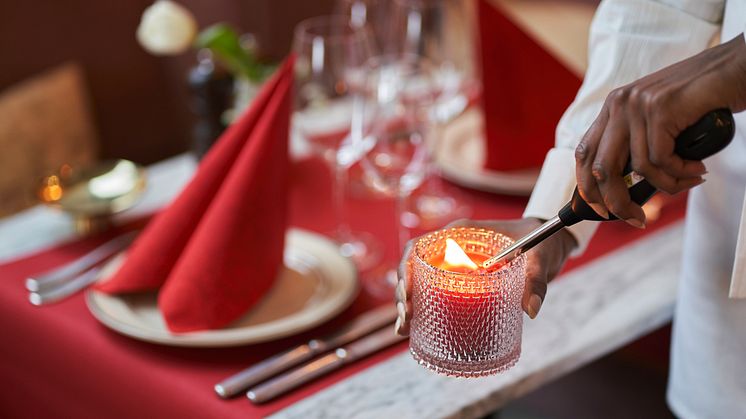
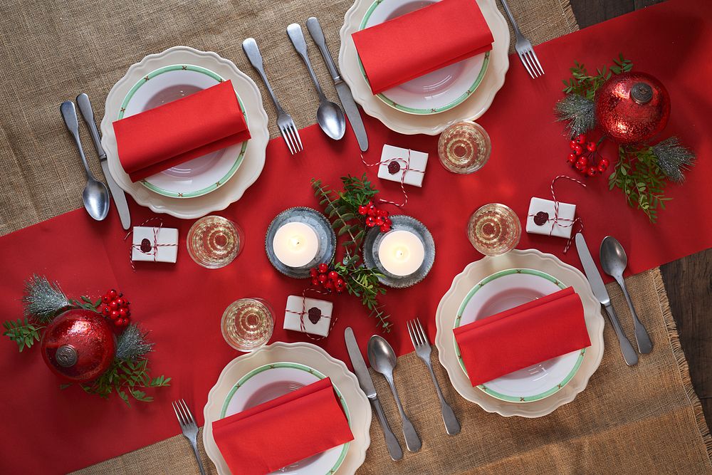
1. Red
Increases your guests’ heart rates and can make them feel hungrier. It can also make your guests eat more quickly thus increasing your table turnover. A colour that is not ideal for more formal restaurants and event caterers where you want customers to spend more time on your premises.
2. Orange
Makes people feel happier and more cheerful subconsciously. Due to its warming nature, it makes people feel content and less likely to feel guilty for unhealthy eating options such as desserts. It's a social colour that will work well in casual eateries.
3. Yellow
Some shades of bright yellow have a similar impact as orange, making customers happy and content. Generally, the colour is vibrant and exciting so, it’s not an ideal choice for more relaxed environments.
4. Green
Commonly found in nature, green is an excellent choice for hospitality premises that serve healthy and natural foods. It promotes a sense of freshness and quality to your food offering and is a great feature for salad bars and vegetarian and vegan restaurants.
5. Brown
Brown is an earthy colour that helps guests relax and feel comfortable, rising in prominence due to nature-led initiatives, it conveys a sense of dependability and can encourage customers to come back as repeat customers. It’s a simple colour that features heavily in pubs, bistros, and restaurants with a farmhouse theme.
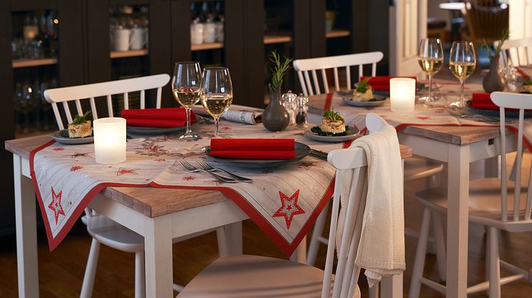
6. White
The industry standard for more formal dining, it gives off a relaxed and leisurely feel encouraging customers to spend more time on the premises. White appears clean, uncomplicated and makes a smaller space appear larger but, too much white can make your dining area appear sterile. Use white as background and bring a pop of colour through the clever use of napkins, napkin pockets and placemats.
7. Black
You can use black strategically to make other colours in your scheme 'pop' and look more vibrant but, avoid using too much black as this will make your dining space look cramped and dark, making it uncomfortable for guests. If black is key to your restaurant, consider using LED lighting to offset the darkness.
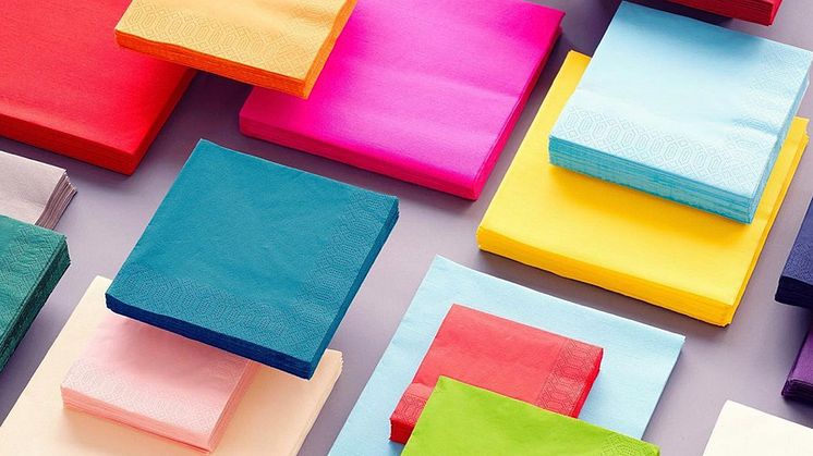
At Duni, we offer an extensive range of compostable colours – the most extensive available on the market. The natural choice if you want to create a colourful mood and still care for the environment.
- OK Compost & FSC® certified
- Contains no chemicals that harm nature
- Biodegrade a few weeks after industrial composting.
Why not explore how adding colour to your restaurant can improve your business?